Project
Nike Run Club - Add a feature to an existing design system
This was a project that I did for my UX bootcamp. For this project, we had to pick an existing mobile application and add a feature to it. I wanted to choose an app that I use often and one that I had some feedback on.
My Role
UX Researcher
UX/UI Designer
Problem Statement
With social media becoming more apparent in our lives, we scroll through our feed to like and comment pretty often. What if we take that social feature and add that to Nike Run Club app to empower each other to get up and be more active?
Competitor Research
Research Goals
Understand the running app industry
See common features and themes
Methodology
Competitive Analysis
Feature Comparison Chart
Results
Tracking runs statistics
Only some of the apps has a running community
User Research
Research Goals
Understand why users choose other running apps over NRC
Uncover any pain points when using an app
Discover what features is lacking in the NRC
Methodology
I conducted user interviews on a wide range of runners - from beginners to runner runners
User Interviews
Results
4 out of 8 users use the NRC because of the guided runs
The other 4 users use Strava because of the social feature
All users expressed that they love exploring new routes
Creating the framework
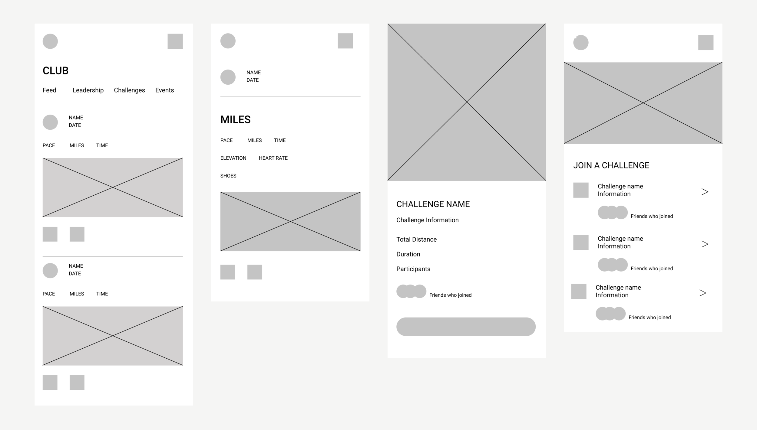
I started sketching out in my notebook how I could integrate that feature into the existing design system.
I sketched out how it would look like on a feed, details page, and the challenge page.
I immediately started creating the wireframes in Figma
Add a feature to an existing design system
Once I got the initial low fidelity wireframes down, I immediately jumped into creating the different screens.
Feed
For the feed, users are able to like and comment on each other’s runs. They are also able to see a brief statistics and also the route.
01/03
Feed
For the feed, users are able to like and comment on each other’s runs. They are also able to see a brief statistics and also the route.
02/03
Run Challenges
Users are able to join in run challenges with their friends. They are also able to see who joined the challenges. Once joined, they can see how against their friends
03/03
Start a Run with a friend
Users are able to select which friend they want to start the run with. After the run, users can see a summary of the run. If given, users are able to see which shoes their friends wore on that run
Testings and Next Steps
I did the prototype and usability testing directly through Figma. I sent the users the link to the prototypes and asked them to perform the given task through a screen sharing through zoom. After the testing, I asked them a series of questions
Prototype
For the prototype, I created it based on 3 different tasks flow:
Click on the shoe detail from a friend’s detail run
Start a run with a friend
Start a challenge and view the leaderboard
Usability Testing
At the end of the usability test, I asked each user about their thoughts regarding the designs and if they experienced any difficulties. All of the users were able to complete out the 3 tasks easily. With this feedback, it tells me that I didn’t need to iterate anything with the current designs
Next Steps
The UX design project taught me how to be aware of the existing design system. This project reassembles what it will be like if I were to work as a UX Designer at a company.
The next feature that I would add is an outfit information section, like the already existing shoe information, users are able to see what their friends are wearing on their runs and have the choice to purchase it directly from the app. Another feature is weather information. Weather affects your runs, it has an impact on your statistics so having this added feature would be helpful.


